

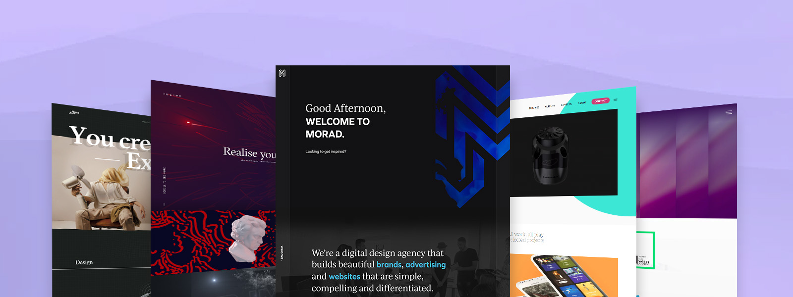
Digital design agencies are expected to be masters of the creative sphere. Their creative portfolios should be innovative and up-to-date with current user experience design trends. The single most important portfolio piece for a design agency is its website. That’s because an agency’s website is their #1 chance to showcase their abilities and sell you on their web design services. However, some agencies take it over the top by creating overly flashy websites that hinder the user experience.
We’ve collected some of the very best design agency websites from around the globe. Browse through these top agency websites for a truly unique digital experience.
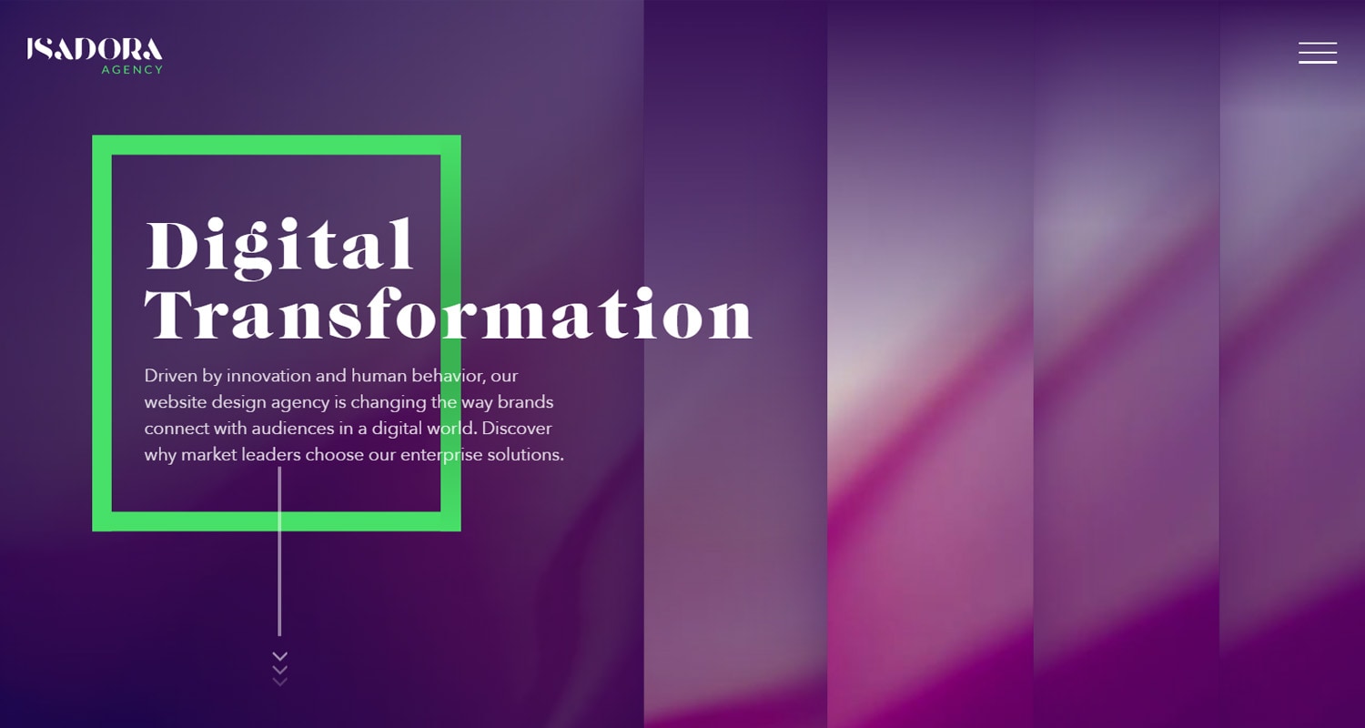
Isadora Agency is a New York-based web design agency specializing in user experience (UX) design, web application development, and web analytics. The agency’s brand is colourful and modern giving it an innovative feel.
Isadora Agency’s focus on creating a positive user experience is evident throughout their web design. The website is bright and colourful with gooey mouse-over animations. It has a unique navigation menu that when you click, text boxes slide to the center of the screen with different pages to choose from. Melting effects consume the page as you scroll down and just about every element has mouse-over animations. The attractive UX and unique animations make this website a top contender for best agency web design.
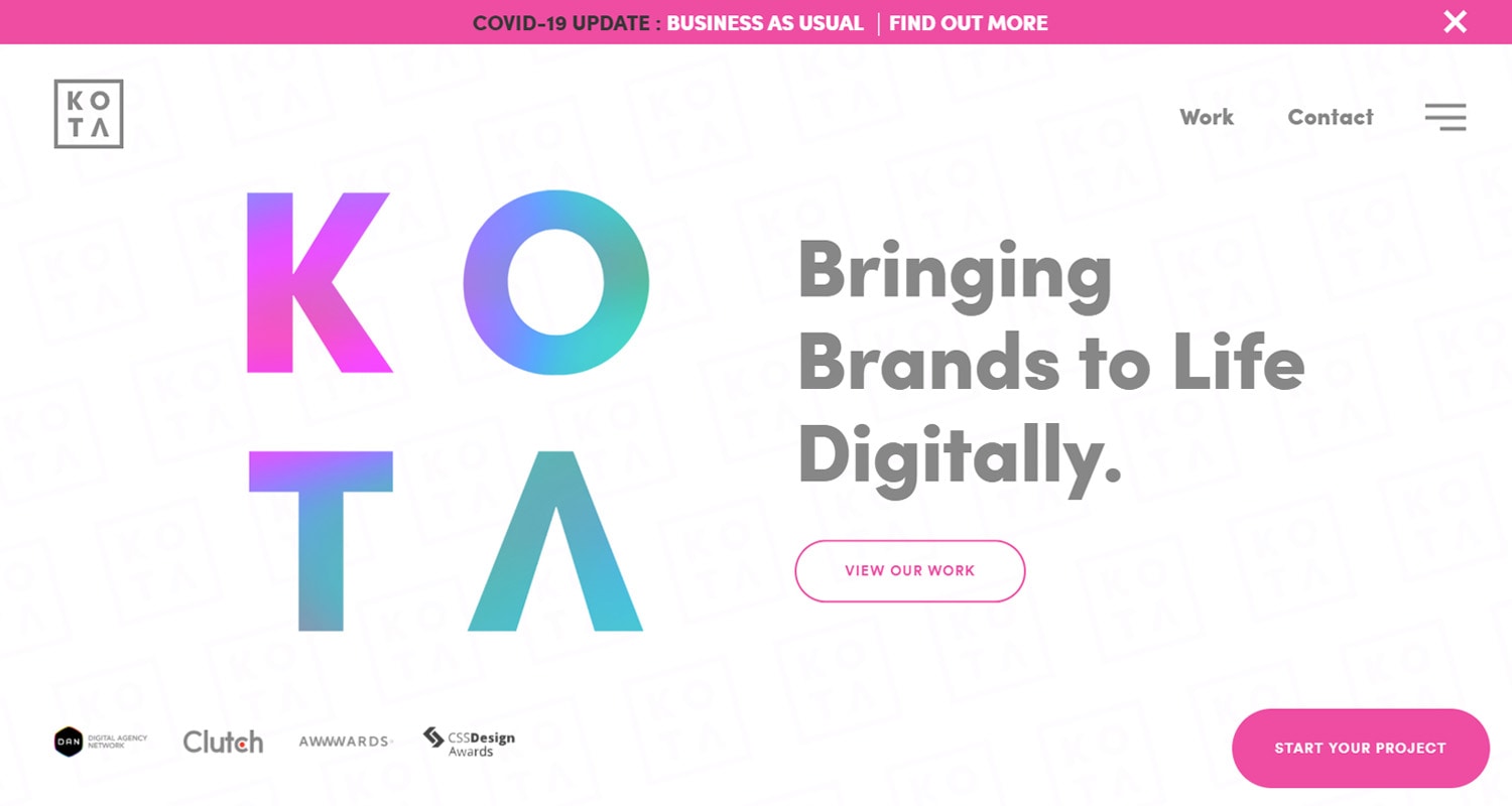
KOTA is a creative web design agency based in London, United Kingdom. The agency specializes in WordPress websites and branding. KOTA's client list includes luxury and high tech UK brands.
KOTA’s website has a liquid banner that follows your mouse and distorts the banner. The web design is rather simplistic but the imagery is high resolution with smooth animations. The site has a great blog with interesting articles and attractive graphics. The portfolio page is nicely laid out with filters to see different project types such as Branding, Digital Marketing and Web Design.
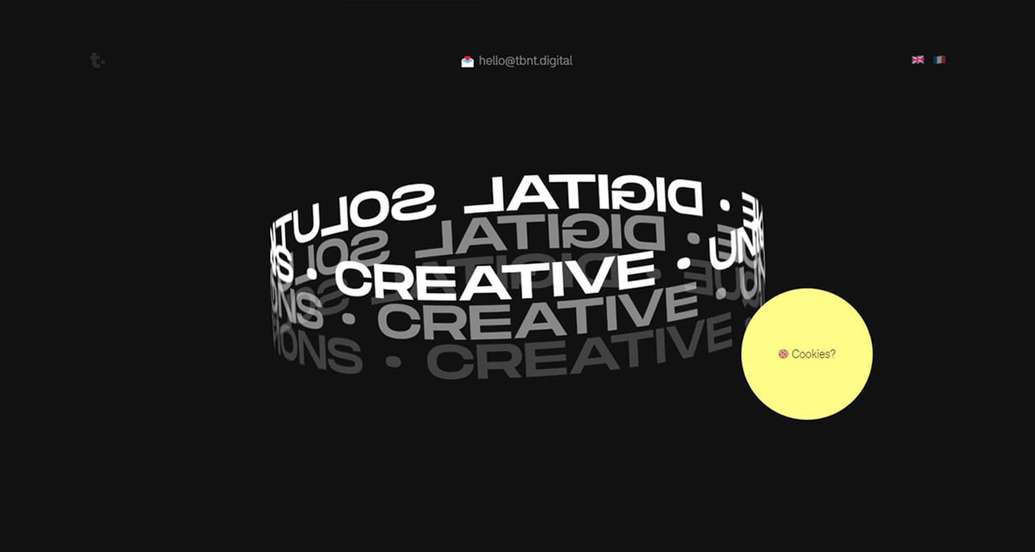
Thanks but no Thanks is a Swiss digital design agency catering to British and French companies. The agency specializes in out-of-the-box web design for innovative brands.
TbnT’s website uses cookies to tailor greetings for new and returning users. If you hover over the ‘Cookies’ button the screen fills with a gif of zoomed-in cookies. This feature is fun but not great for web accessibility as it has flashy video graphics.
The website maintains a conversational tone as you scroll down the homepage with a strong storytelling focus. It has unique functionality such as a light mode and dark mode. There is no navigation menu, you must scroll down and click the different links to go to other pages. The portfolio pages offer an engaging walk-through of each creative project.
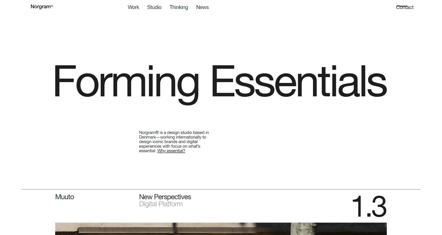
Norgram is a creative design studio located in Copenhagen, Denmark. They have worked with top brands like Nike, Ikea and Amazon Web Services.
Norgram’s website is one you have to spend some time on to get a feel for its unique design features. The homepage features an interactive timeline with horizontal scrolling. Overall, the site has a somewhat minimalistic feel with more of a focus on copywriting. The parallax sliders and animated graphics give it an interactive feel. However, the text-heavy design and the off-center images make it a bit confusing to navigate.
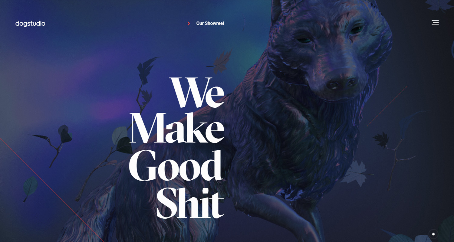
Dogstudio is a boutique creative studio based in Belgium. It is a smaller agency focusing on branding, animation and using emerging technologies to create one-of-a-kind digital experiences.
Dogstudio’s website is one of the most unique designs out there. It features a dog rendering that rotates and changes size as you scroll down the page. All page elements have silky smooth animations or mouse-over effects. The creative agency’s portfolio is impressive and engaging to scroll through.
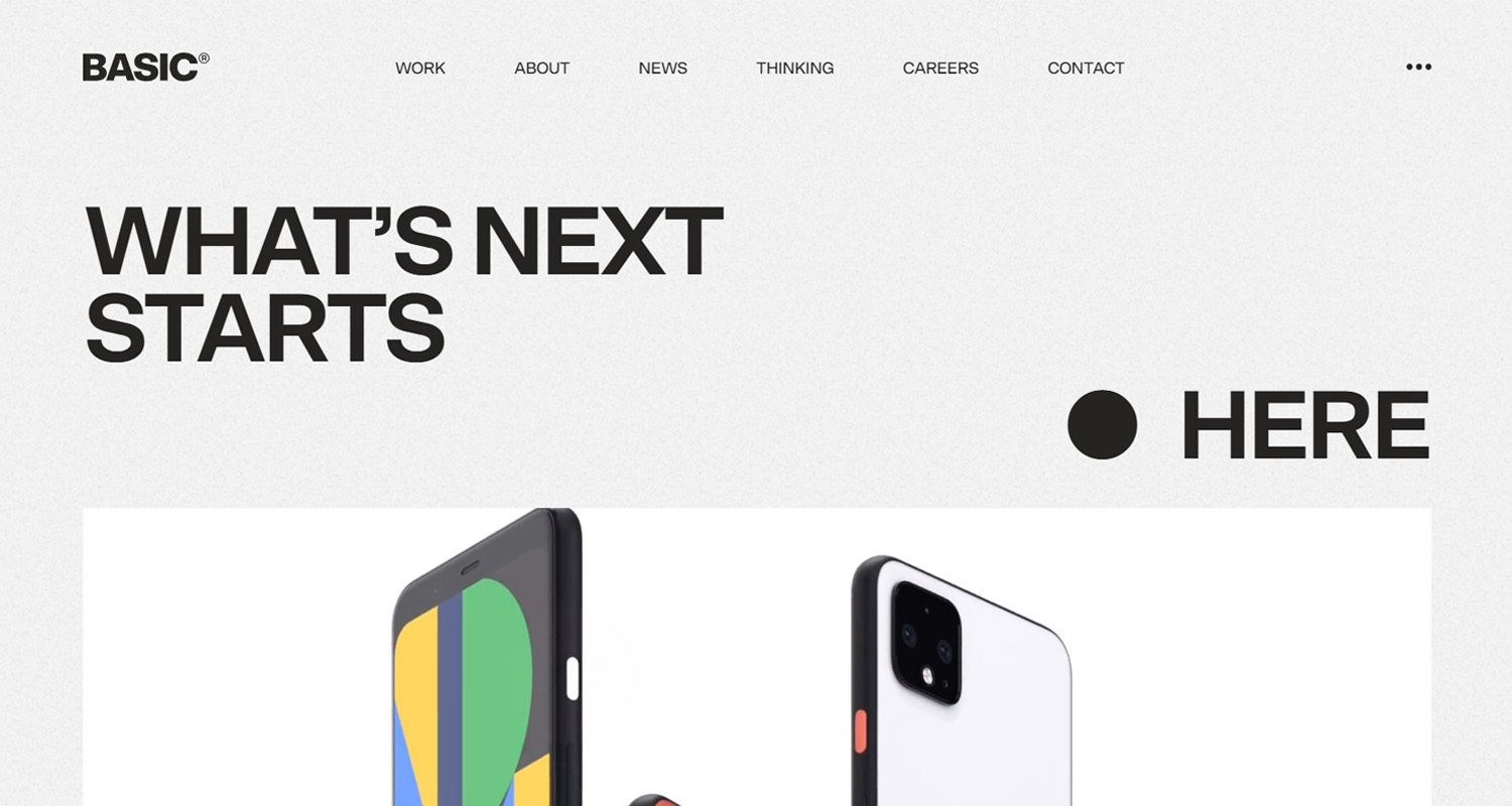
BASIC is a top branding and digital design agency located in the San Francisco Bay Area. The agency has worked with some of the largest brands in the world including Google, Airbnb and Patagonia.
BASIC uses video graphics and unique scrolling effects to bring the website to life. The site has a static fuzz background and an interesting navigation menu with images and horizontal scrolling to show off their portfolio pieces. The agency is one of the more well-known agencies around the world with San Francisco-size prices.
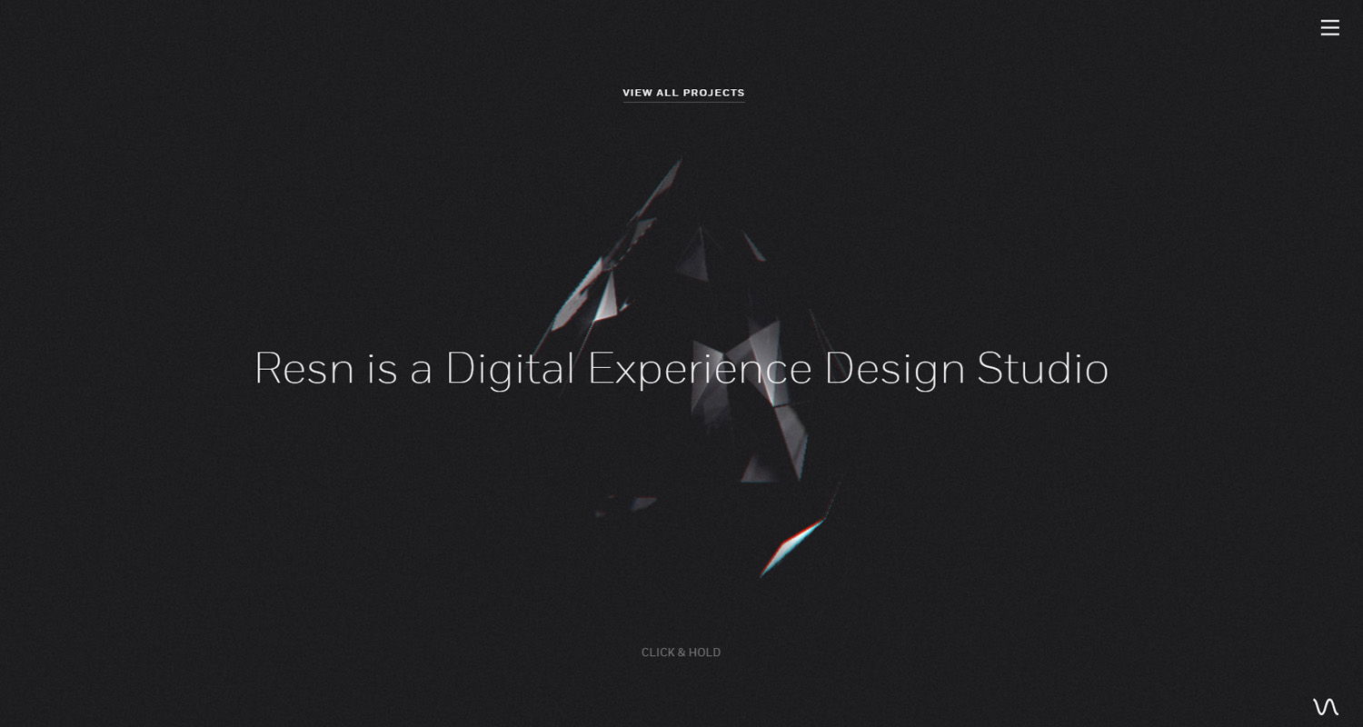
Resn is a New Zealand-based digital design studio. Their specialty is creating highly innovative digital experiences. Some of their most impressive clients include Spotify, Adidas and HBO.
To view the content on the website, you must first click and hold the screen for an engaging video to load. The navigation menu is very simplistic with only three options to choose from; About, Work and Contact. The portfolio is fascinating to scroll through and features interesting creative pieces to get lost in. Even the music draws you in with subtle beats and chimes. The website is a bit difficult to use on mobile as it is slow to load and the click and hold features are not as intuitive.
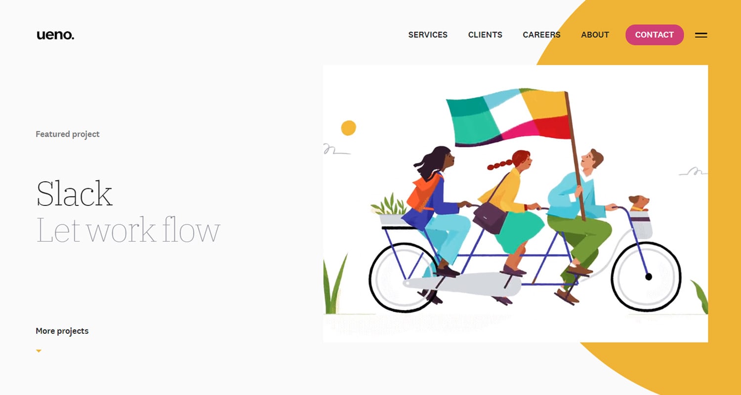
Ueno is one of San Francisco’s best-known creative agencies. They typically deal with bigger budget clients such as Google, Facebook, Uber, Visa and Apple.
Ueno’s website is engaging from start to finish. There is a strong attention to detail as shown on their 404 page which has a fun video graphic. The agency’s featured projects cycle through the homepage banner each time you refresh the page. One of the website’s best features is the portfolio items as you scroll down the homepage. The images have subtle motion and eye-catching animations pop-up the more you explore the site.
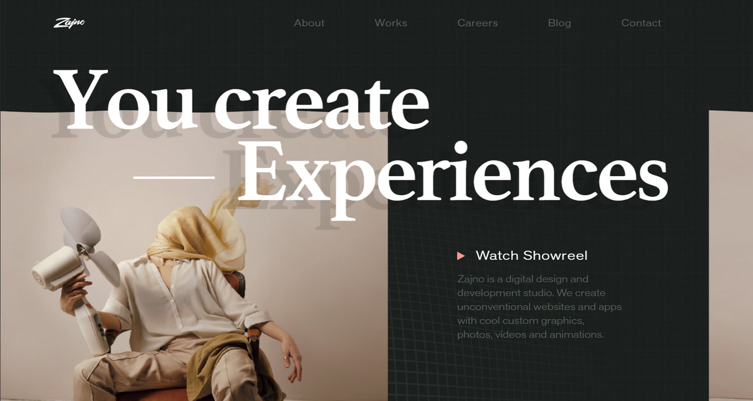
Zajno Crew is a top digital design agency located in Los Angeles. They typically work with high tech brands in California. Their specialties include animation, illustration, and web design & development.
Zajno’s website is highly interactive. The grid background follows your mouse and the images have a liquid effect. On the homepage, if you click on the ‘Keep Away’ button, turns the site into a techno dance party with trippy colours. This feature is fun, but not very accessible, particularly for people with photo-light sensitivity.
The agency has a unique portfolio page with background and mouseover effects as you scroll through it. The portfolio pages themselves tell an interesting story of each project, with animated headers, descriptions and beautiful imagery.
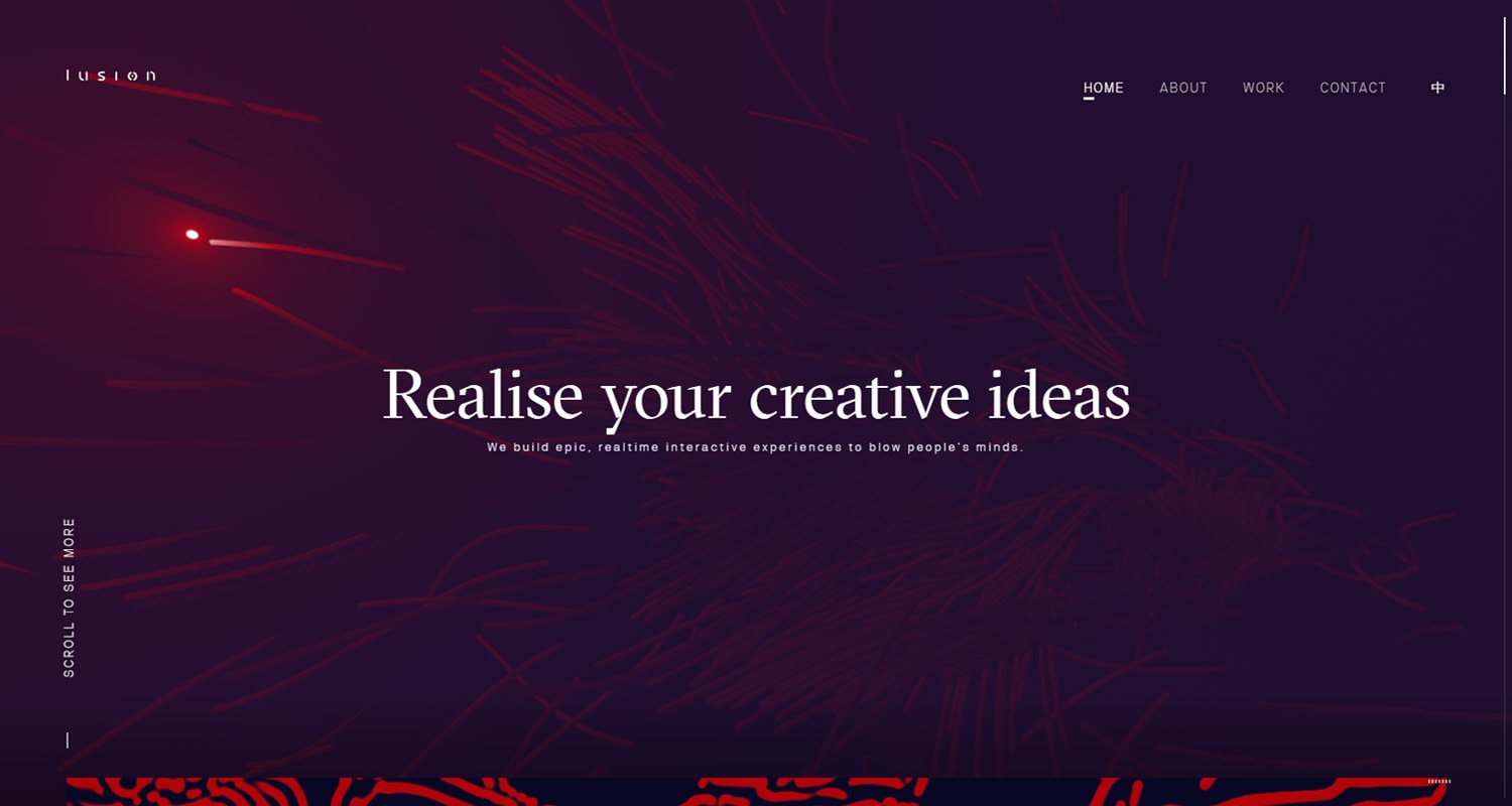
Lusion is a creative studio based out of Bristol, UK. Lusion’s vision is to bridge the gap between abstract concept and immersive experience through technology. The agency specializes in web development, virtual reality and 3D animations.
Lusion’s website offers a truly immersive digital experience with interactive backgrounds, sound effects, text animations and videos. The homepage banner catches your eye right off the bat with a flashlight mouse that illuminates new content as you scroll. The navigation menu makes laser noises and spins when you mouse over the menu items.
The scroll on Lusion’s website is slow but very slick. It forces you to take your time in navigating the site and exploring the site.
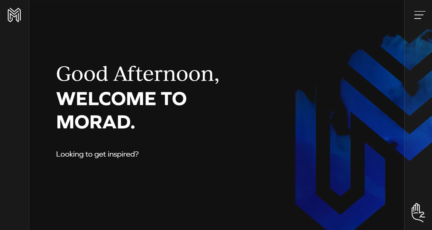
MORAD Creative Agency is a digital design agency based in Calgary, Alberta. We designed our agency’s website on our proprietary content management system, Morweb CMS. The goal of MORAD’s website is to showcase our web design abilities without compromising the user experience. We incorporated smooth mouseover effects, dynamic rollover images, and tilt effects while maintaining a clean navigation. The portfolio pages give excellent insight into our design capabilities and can be filtered by service category.
A unique feature of our website is the ‘Don’t Click Here’ button located in the bottom corner which brings up a surprise message when you click it. The homepage also has multiple greetings that adjust to the user’s time zone. Browse through our portfolio to have a digital conversation with some of our best work.
Categories: Web Design,