

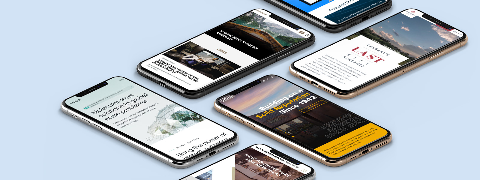
In this day and age, there’s no question, having a responsive website is essential to the success of your company. If your website design is fixed or non-responsive, you could be losing out on countless conversions such as online purchases, newsletter sign-ups or donations. Site visitors won’t stay long on your website if it isn’t optimized for the device they’re using.
To help get you inspired with your web design, we’ve compiled a list of best responsive websites. Browse through these great examples on your desktop computer, tablet and mobile to see how these websites provide an exceptional user experience on any device:
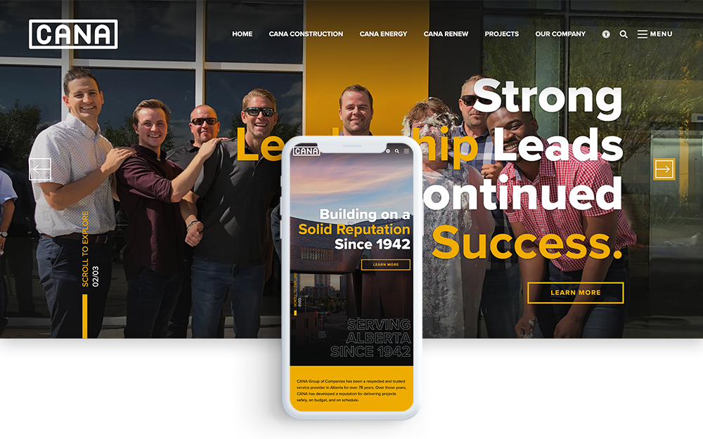
CANA Group of Companies is an Alberta-based corporation comprised of four companies; CANA Construction, CANA Utilities, CANA High Voltage and CANA Renew. For over 78 years, the corporation has been a leader in commercial land development, high voltage and utility sectors. CANA’s website effectively reflects its brand image and beautifully showcases their work.
CANA’s bold typography, wide image banners and smooth mouse-over effects draw the user in and incite them to explore. There are so many different layers to the web design that there’s always something new to discover. CANA’s accessibility features are a nice touch allowing site visitors to further customize their user experience by adjusting the font, font size, highlighting links and more.
The website is equally engaging on smartphones and tablets. All elements of the web design are automatically responsive. The images and graphics seamlessly adjust to fit the user’s screen size resulting in a great experience on every device.
CANA recently redesigned its website with MORAD Creative Agency. MORAD is also based in Alberta and has developed websites for several real estate and land development giants. CANA’s website was designed on the creative agency’s custom content management system, Morweb CMS. The Morweb platform provides maximum design flexibility and makes it easy for the site admin to keep the content updated.
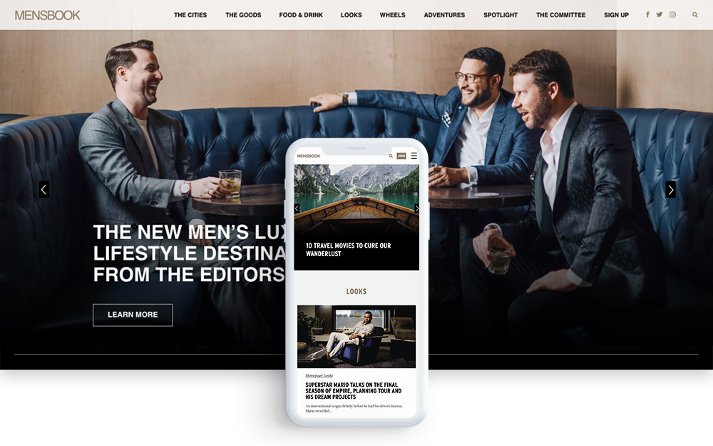
Mensbook.com is the hottest digital destination for men’s luxury lifestyle. The site features stunning photography and great content on everything from men’s fashion, arts and culture, fine dining, sports cars, high-tech tech gadgets, real estate and travel.
The MensBook website oozes luxury from the outset. The branding on the website is very clean and the imagery draws readers in. The web design does a great job of highlighting the content with a blog format with elegant mouse-over animations. The blog posts have infinite scrolling so you can easily explore other articles and immerse yourself in interesting stories.
MensBook is owned by Modern Luxury Media. The media giant designed the MensBook website through MORAD Creative Agency. MORAD also designed the company’s corporate site and other magazine websites. The website was built on the creative agency’s content management system, Morweb CMS. The main benefits of this platform are the customizability and ease of use for non-technical users.
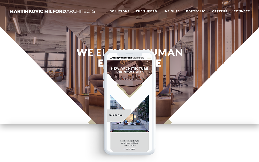
Martinkovic Milford’s website conveys innovation through eye-catching geometric shapes and elegant iconography and typography. The San Francisco architects’ website is jam-packed with responsive elements that make for an engaging user experience on desktop and mobile.
Martinkovic Milford’s responsive web design captures your attention from the moment you land on the homepage and draws you in the more you scroll. The stunning photography and silky smooth page animations overload your senses as you browse through the content. The site does a great job of conveying the brand’s unique design capabilities, however, the triangular shapes and constantly changing background images make the text a bit difficult to read.
The mobile version seamlessly adjusts to fill the screen and the animations load nicely as you scroll. The mobile version is actually more digestible because it shows more of the content at once in a one-column layout.
Martinkovic Milford Architects designed its website through Isadora Agency on WordPress. The digital design agency is known for creating unique web experiences for California brands. The development for this website was likely a challenging process due to the extreme customization of the design.
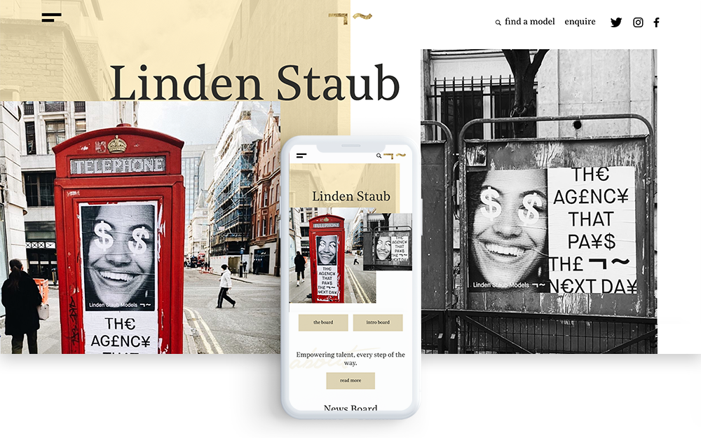
Lunden Staub is an up-and-coming modelling agency in the UK. The website design is very chic and minimalistic offering an enjoyable user experience on all screen sizes.
Linden Staub’s website has a very clean design that draws the user in with flowy page animations. The ‘board’ page showcases the talent in a visually engaging way. You can see the model’s stats when you mouse over their headshot. The ‘news’ page features their articles in a very creative way giving you a runway shot of the fashion models in action.
The mobile version is even better than the desktop version because you can see more animations at once with the longer screen. The only drawback of the many animations is a slower load speed.
Linden Staub’s responsive website was designed by award-winning agency Kota. Kota is known for doing highly customized websites in the UK. This website likely had a very intensive development process to fine-tune each responsive element.
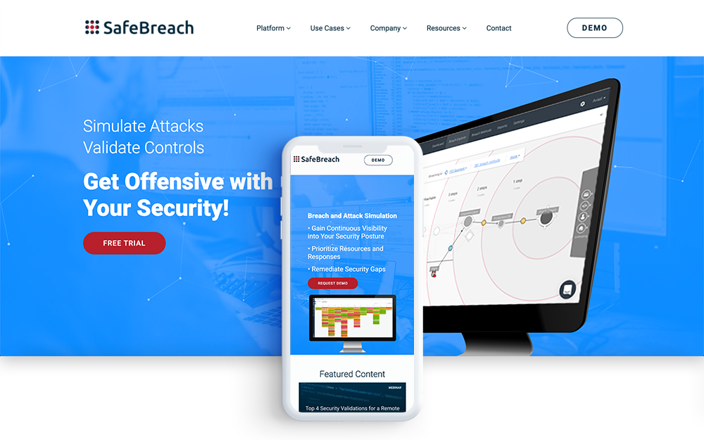
SafeBreach is a breach and attack simulation company. They test companies’ security systems by simulating attacks and finding vulnerabilities to provide solutions to remediate security gaps. SafeBreach’s website reflects the company’s innovative nature and clearly articulates its mission with interactive animations and videos.
This website has tons of responsive elements including videos, icons, buttons, and images that seamlessly adjust to fit your screen size. SafeBreach’s homepage features an animated timeline outlining the benefits of their services. The interior pages have an interactive banner that follows your mouse when you scroll over it.
The navigation menu utilizes a large dropdown or “mega menu” that is easy to use from any device. On tablet and mobile, the main menu collapses into a hamburger menu while keeping the ‘Demo’ button in the top navigation bar. This is a responsive web design best practice to ensure your most important page is easily accessible even on smaller devices.
SafeBreach designed their responsive website with MORAD Creative Agency. The web design was customized to match the SafeBreach brand and give the site a “high tech” feel. Because SafeBreach is an attack simulation company, they are more vulnerable to hacking attempts which is why they needed a website platform with high security. SafeBreach’s website was built on Morweb CMS for its strong security and powerful website features.
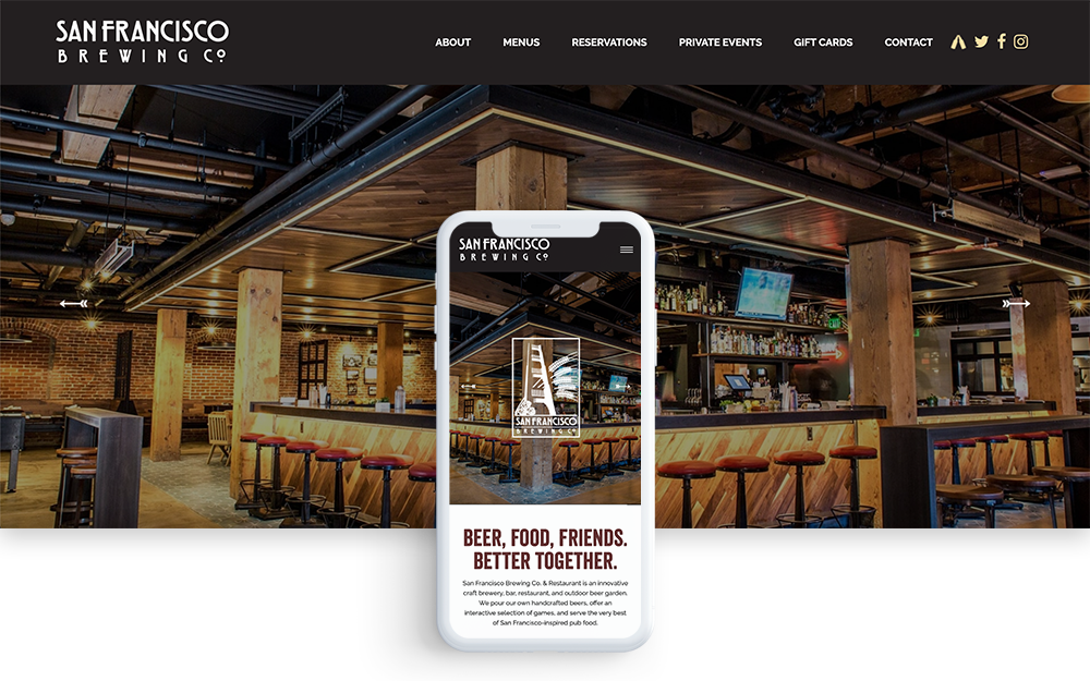
San Francisco Brewing Co. & Restaurant’s website does a great job of capturing the company’s brand and relating to its San Francisco audience. The brewer’s beautiful photography shows off their craft beers, delicious food and fun atmosphere.
SF Brewing’s website is packed with responsive elements. The website comes to life as you scroll through the homepage through the use of engaging page animations, live counters and dynamic image sliders. The website looks equally as great on mobile. The wide image banners scale nicely for the smaller screen size and the navigation menu is very intuitive to use.
SF Brewing designed its website through MORAD Creative Agency. The agency’s custom touches really pull the website together. MORAD uses the Morweb platform to design and maintain the website.
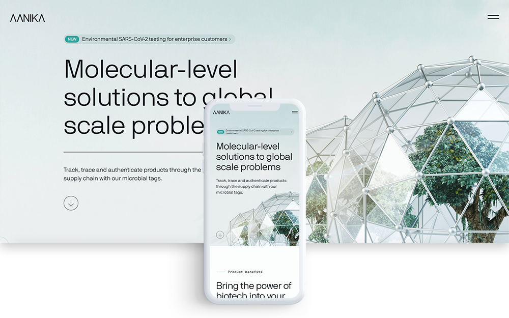
Aanika Biosciences is an innovative bioscience company specializing in supply chain tracking for crops. Aanika’s web design gives it a high-tech feel with the use of gridlines, clean typography, beautiful photography and slick page animations.
The page animations are what give this website its “wow” factor. They are silky smooth and make the content flow nicely as you scroll down the page. The graphics and typography give the site a scientific feel while showcasing their content in an easily digestible format. Aanika’s website also functions great on mobile with perfectly timed animations and easy-to-follow navigation.
Aanika Bioscience’s responsive website was designed by the Good Kind agency out of Vancouver, BC. The creative agency specializes in design and strategy. The website was custom-developed by their web design team.
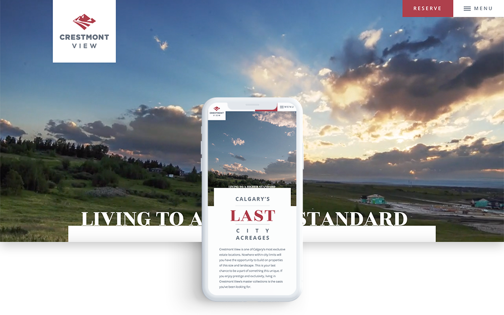
Crestmont View is a Qualico Community located in Calgary, Alberta. The website showcases this vibrant new community with a stunning responsive web design.
Crestmont View’s website features an engaging video banner and smooth page animations. The vibrant imagery and creative effects give an enjoyable user experience on every device. The navigation menu collapses into a hamburger menu on mobile and tablet while keeping the ‘Reserve’ button in red to encourage site visitors to sign up for updates on the community’s development.
The website also offers a unique way to showcase the community's estates with an interactive lot map and aerial footage.
The web design and community branding were designed by MORAD Creative Agency. The website was built on Morweb CMS and the videos were shot by 4K Film Production.
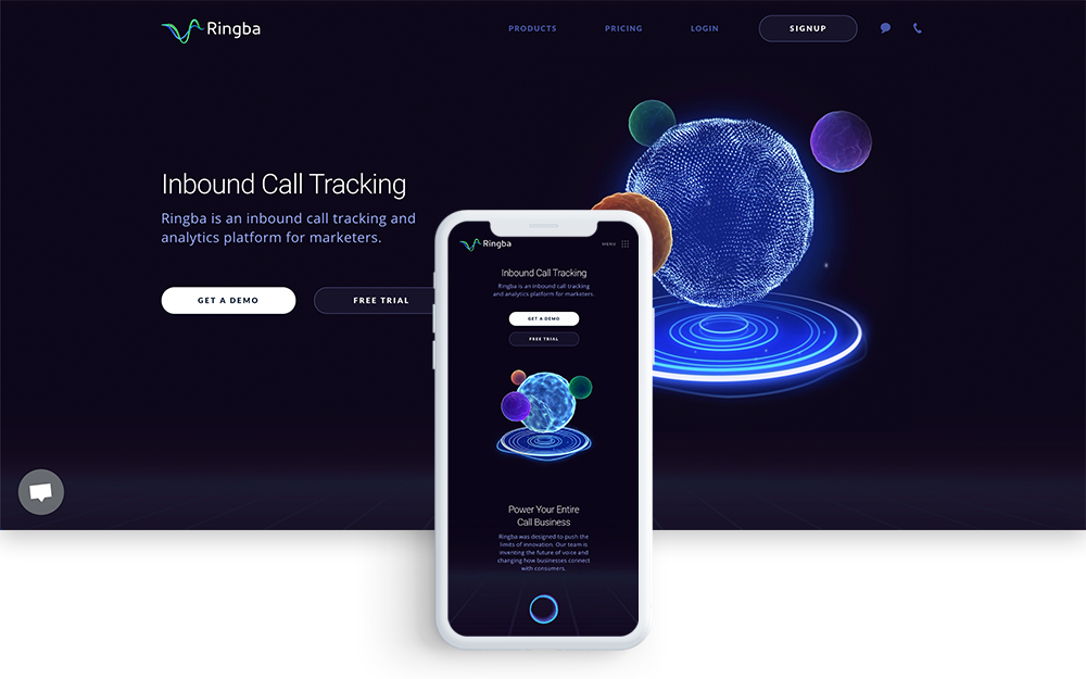
Ringba is an inbound call tracking and analytics platform. The website gives off a high-tech feel. The swirling backgrounds and dark user interface seamlessly match the brand image.
The first thing you see when you land on the homepage is a floating graphic that immediately catches your eye. As you scroll down the page, the content floats upwards to bring the site to life. Even the buttons and icons are animated. As you explore further, you can find video backgrounds and even images with mouseover effects in the navigation menu.
On a mobile device, the floating images adjust nicely to fit the screen and the animations flow seamlessly making for a great responsive web experience.
Ringba’s website was designed by Zajno Crew, a New York-based digital design agency known for its innovative designs for international brands.
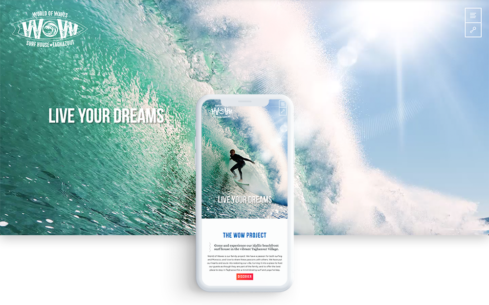
World of Waves is a renowned surf house located in the vibrant Taghazout Village of Morocco. The company’s website is bright and colourful giving off fun surfer vibes to match their brand image.
World of Waves’ website offers an engaging user experience with unique branding, custom iconography, smooth animations and beautiful photography. The image galleries showcase the images in an interesting and eye-catching way. The site’s background adds to the branding of the site with splashes of colour and animated surfboards.
The surfing company’s website was designed by 8ways Media out of Switzerland. The web design agency specializes in creative design and development for international brands.
A great responsive web design is essential for any modern business. With the growth of mobile traffic, your website must be fully functional on every screen size. If you’re unsure if your website is responsive, use Google’s free mobile-friendly test and book a free website consultation with the MORAD team.
Categories: Web Design,